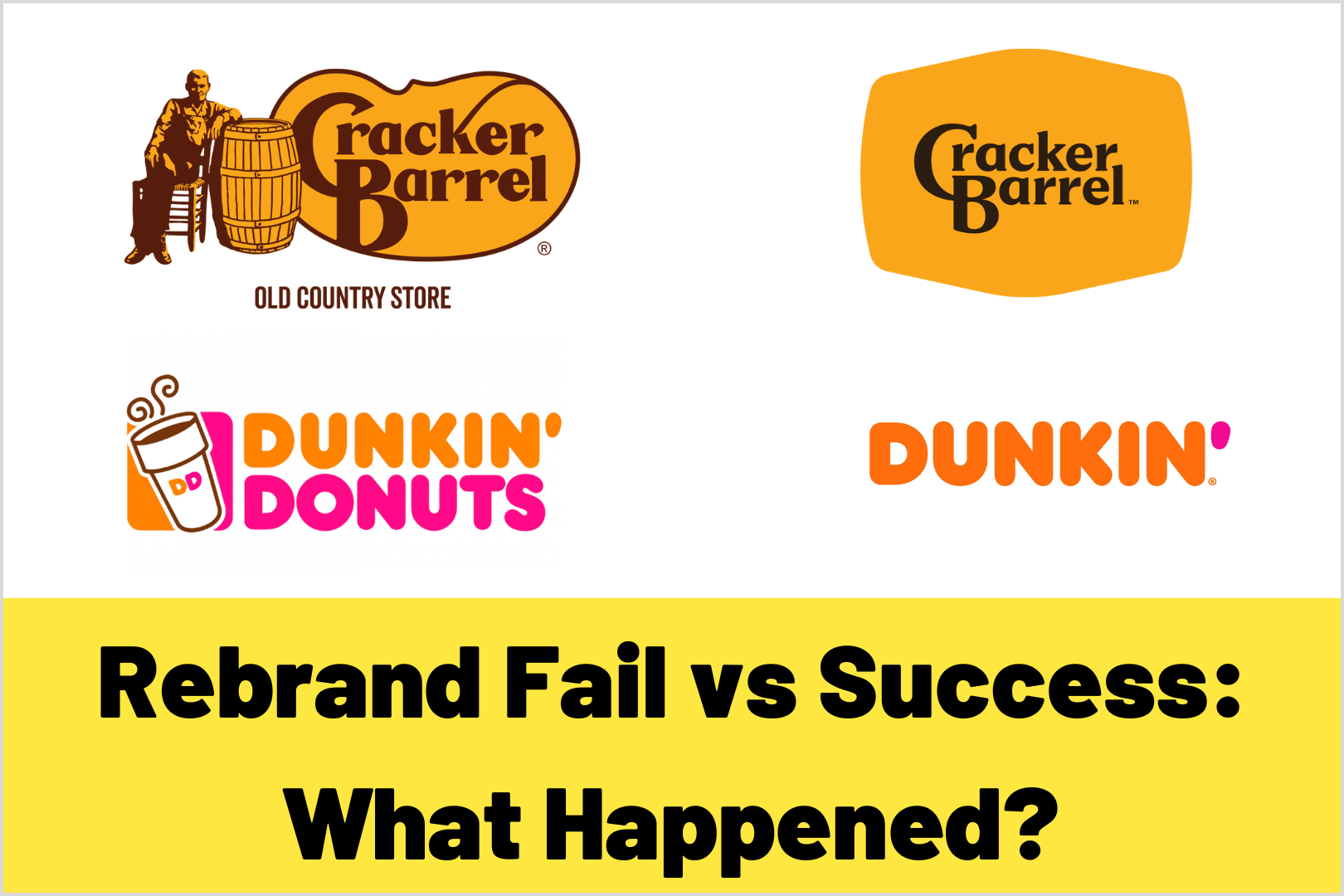
Rebranding Fail vs Success: Cracker Barrel and Dunkin
Brands that stick around long enough eventually reach a point where they must decide how to evolve their business in order to stay relevant and grow.
In recent years, Dunkin’ (formerly Dunkin’ Donuts) and Cracker Barrel both took steps to modernize their brand identities. But while one rebrand generally succeeded in advancing relevance without sacrificing identity, the other stirred controversy, customer backlash, and ultimately a retreat.
In this post, we’ll compare Dunkin’s smart balance of change + continuity with Cracker Barrel’s more disruptive rebrand (and what went wrong). If you’re thinking of rebranding, this is your guide to doing it in a way that retains your identity and grows your audience.
Table of Contents:
- Dunkin’s Rebrand: What They Did Right
- Cracker Barrel’s Rebrand: What They Attempted & Where It Missed the Mark
- Visual References to Compare
- Lessons to Avoid Failed Rebranding
- Contact COLAB for Branding and Rebranding
Dunkin’s Rebrand: What They Did Right
Key Moves
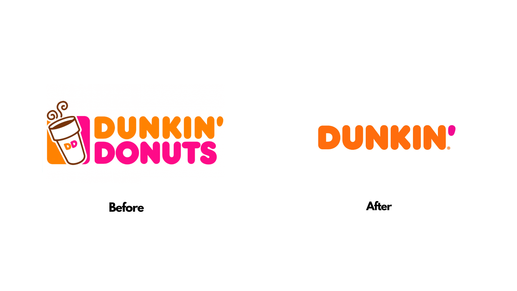
- Name shortening: In 2018, Dunkin’ officially dropped “Donuts” to become just *Dunkin’*. The name change aligned with the reality that people already called it that. It reinforced the shift toward being beverage-led and convenience-focused.
- Visual continuity: They kept the iconic pink & orange color palette, energetic fonts, and many visual cues that customers already recognized. No radical change in visual voice. Just a cleaner, more modern execution.
- Focus on convenience & experience: Dunkin’ renovated stores, added mobile ordering and drive-thru options, made physical spaces more efficient for on-the-go behaviors. The rebrand wasn’t just cosmetic. It reflected actual shifts in what customers wanted.
Why It Generally Worked
- Maintained brand equity: Because they preserved the color palette, much of their visual identity, and the spirit of what people already loved, the change felt like evolution, not erasure.
- Clear messaging: Dunkin’ told its audience what was changing and what was staying. Donuts weren’t disappearing; the core promise of fast coffee + friendliness stayed intact.
- Audience alignment: They leaned into the shift toward beverages and convenience, a trend already underway, especially among younger audiences. The rebrand met a need, rather than forcing a new concept.
Cracker Barrel’s Rebrand: What They Attempted & Where It Missed the Mark
What They Changed
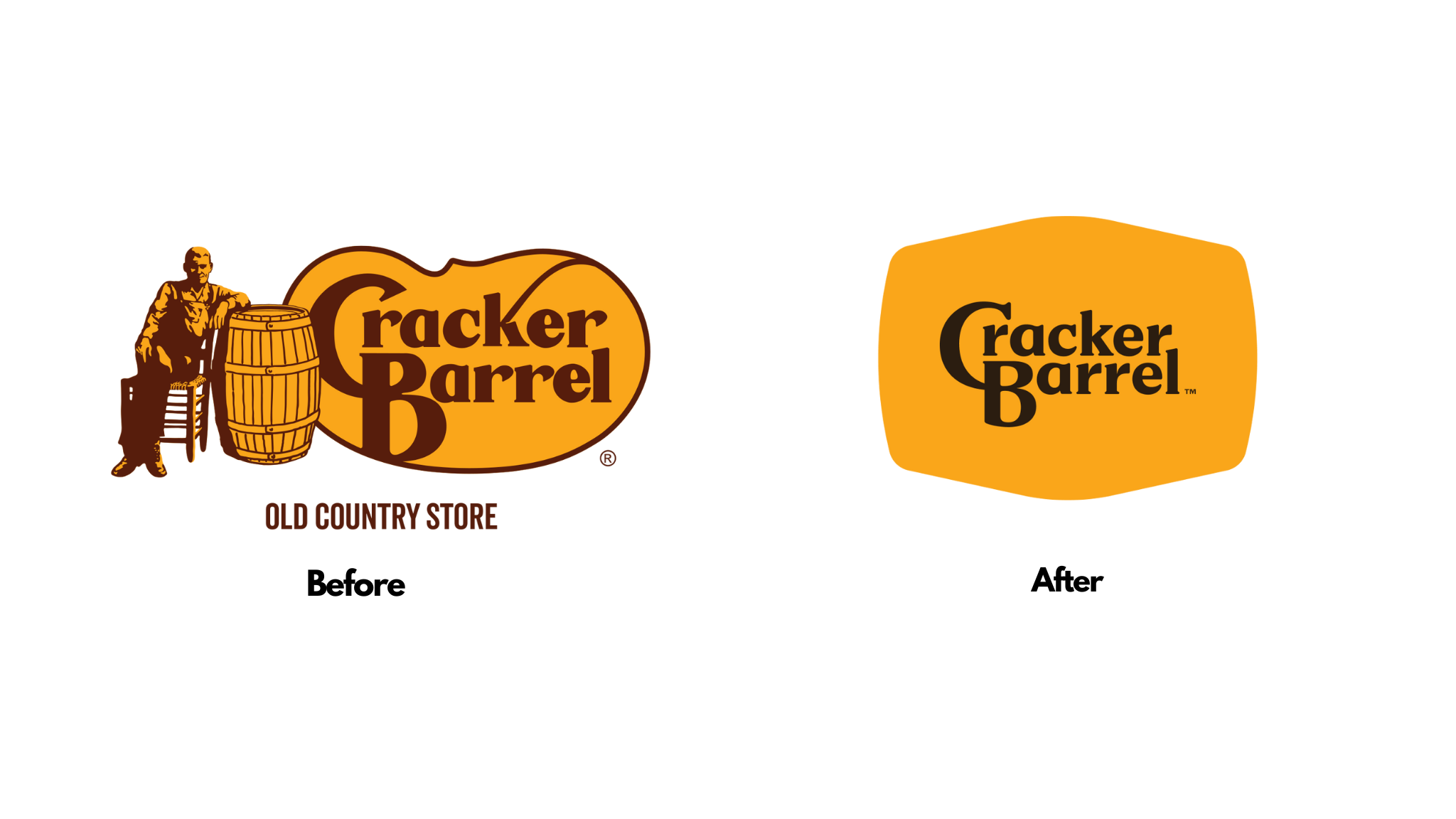
- Simplified logo: Cracker Barrel, under new leadership, rolled out a strategy to modernize: simplified logos (removing or de-emphasizing heritage imagery like Uncle Herschel), lighter, brighter interiors, more “contemporary” design in stores. The visual identity was made simpler, the signage and atmosphere more modern.
- The intention: attract younger customers, refresh perception, appeal in digital and mobile environments. In short: look less like a formal, old-country chain and more approachable, stylish, up-to-date.
What Went Wrong
- Emotional disconnect: Many loyal customers saw the old branding as part of what they loved: nostalgia, comfort, tradition. The heritage icons had emotional weight. Removing or simplifying them felt like erasing identity.
- Insufficient continuity: Because elements people cherished were removed (e.g. signature imagery, “Old Country Store” wording), the change wasn’t balanced with reminders of what had made Cracker Barrel beloved.
- Backlash & reversal: The negative reaction was swift. Customers, social media, even political voices criticized the change. Cracker Barrel ended up reinstating its original logo and slowing or modifying the redesign efforts.
Visual Comparison: Dunkin’ vs Cracker Barrel
| Before Visuals | After / Rebrand Visuals | What You Notice (Continuity or Disruption) |
| Classic logo: “Dunkin’ Donuts” wordmark + icon, using pink & orange, whimsical feel. | Simplified logo with “Dunkin’” only, retaining bold colors | Color continuity preserved, name shortened but familiar fonts remain; experience improved but legacy feel still visible. |
| Before Visuals | After / Rebrand Visuals | What You Notice (Continuity or Disruption) |
| Iconography heavy: rustic heritage imagery, “Old Country Store” branding | Simplified logo, removal of certain heritage features | Loss of visual cues customers associate with tradition; fewer markers of what made the brand feel “homey.” |
Lessons to Avoid Failed Rebranding
Here are some key lessons based on what Dunkin’ got right and what Cracker Barrel stumbled on:
- Honor what your audience already loves
Before erasing heritage elements (logos, mascots, signage), understand which ones carry emotional weight. These are what customers will identify with and defend.
- Change with clarity
Be transparent about what is and what isn’t changing. Tell your audience both what to expect and what you intend to preserve.
- Consistency + roots + relevance = trust + growth
A rebrand should both modernize and remain recognizable. The more recognizable the changes, the less alienating they are.
- Roll out over time
Dash out prototypes, gather feedback, consider limited rollouts. See how customers react. Small-scale changes can reduce risk.
- Use moments for high visibility
Dunkin’ timed much of their rollout with store redesigns, packaging updates, and digital campaigns. Cracker Barrel’s changes felt more abrupt, which magnified customer reaction.
- Measure emotional response—not just sales
Track brand sentiment, loyalty, and recognition alongside performance metrics. If sentiment drops even as sales rise temporarily, that could be a warning.
Contact COLAB for Branding and Rebranding
Rebranding isn’t just about looking “new”—it’s about staying relevant *and* staying true. Dunkin’ demonstrates how you can modernize your name, identity, and experience while keeping the emotional bonds strong. Cracker Barrel shows how removing too many of those bonds can cause backlash—even for a well-loved brand.
If you’re an SMB considering rebrand: audit your heritage, decide what elements are essential, communicate clearly, test before mass rollout. And make sure your new identity still feels like you to the people who already believe in you.